To advertise my skills there are multiple ways such as newspapers and websites however it is best to create a website as I would do in order to show my proffesional skills within the media industry. In order to seek jobs I would look on websites advertising frelancing jobs such as the example in this link http://www.simplyhired.co.uk/a/jobs/list/q-freelance this link shows multiple websites advertising jobs for freelancers and it will show me to the direction of the media industry within the freelancing market. Since I am going into the media industry I must show a proffesional image in order to appeal to the employers that I may work for otherwise I am less likely to recieve the job as I would not look proffesional.
Within the idea of the logo I will also have to check the spelling and typography of the logo that I am going to be using as it will affect my image if my font is misleading or it is too compact so the reader cannot follow the path of the writing due to the mass amount of text within one area such as line spacing and letter spacing which could be too small to make it easy to read for viewers. Such as the example i will provide "The quickbrownfoxjamp overthelazy dog" and "The quick brown fox jamp over the lazy dog" as the second sentence shows it is easier to read on the eye and therefore much more easier to follow to customers or employers that will want your skills.
Another important error that could occur is the unity of letters when showing a header for a brand or even a logo as a way to appeal to the audience and as an example i will use a made up logo showing one with good and one with bad unity "D E C KM AK E R S" and "D E C K M A K E R S" as shown by the second logo it shows more unity between the letters and although it is not always seen it is a very common error which could happen with a logo of professional standards so the letter spacing is crucial in creating a logo.
when creating an article it is not always used but splitting the pages into half and then using them as a 2 page document on one page helps stop the eyes from been tired when reading an article as shown by this link: http://www.thedesigncubicle.com/2008/12/10-common-typography-mistakes/
 As you have noticed from the picture the bottom text is much easier to read as the text looks as if less writing is there when however it is the same amount of writing but spaced out in a easier way. Although this isnt always advisable it is a good idea to use within articles on a website when explaining your skills or on the home page and it may show some parts where it has to cut the word down and be used on the line below but it showers easier writing compared to the lines above. This helps get employers attention when you are in a professional business.
Another important error to look out for when creating a header for your freelancing environment is to not overweight some words more than others are this may mislead the reader into missing parts of your article which may have been relatively important to their needs of what they want from you or for you if u have specific needs. Here is my example of a bad overweight "In my article I WILL explain how throwing a 7 is the BEST chance of succeeding" and here is a good example "In my questionaire 47% of British people prefer HP brown sauce to Hp tomato sauce" it shows less weights and therefore it is not so easily mistaken as bad information to the reader.
Colours when on backgrounds are crucial when it also comes to a reader viewing your work or an article you have created as they would not look good if they were showing text in a dark background with dark writing such as :http://www.thedesigncubicle.com/2008/12/10-common-typography-mistakes/
 The text doesn't explain much but if u look at the top one compared to the bottom text it is much easier to read the bottom one compared to the text above in the much darker background showing that when planning a background for a website make sure it is readable upon that website. Bad background with similar dark writing can cause a dreary affect and really unappeal a reader while making it light with dark writing shows a sense of easy reading and a nice happy effect.
Another effect to look for is tint effects and to avoid the writing becoming less than 50% as this may cause the reader to be unable to see writing when it is printed off due to merging with the backgrounds as shown on this link:
http://www.thedesigncubicle.com/2008/12/10-common-typography-mistakes/
 The writing is only explaining the sight but as you can see from the above writing compared to the below writing the text itself is much easier and readable on the below one compared to the above and if it were in black and white the above writing may not be seen as the grey may be converted into white when it is printed off causing useful information gone when interviewed by a client and showing printed images.
Grid systems are also very important when designing my website to show my skills as it can display my information into easy to manage titles which could lead to other links and also different topics rather than having it all in one web page and making the web page be exceedingly long and unnappealing to the audience.
http://www.newgrounds.com/ this website may not show the grid system however it shows the grid system by displaying the main topics such as games audio portal sounds music and many more within the titles and links leading to them in order to show the use of a grid system at its fullest.
The best way to advertise yourself as a freelancer is to know the different types of advertisements in order to support myself as a freelancer such as newspapers in order to show myself to any readers of a magazine who maybe looking at the advertisements and job seekers such as this example of a media newspaper ad http://i2.sitepoint.com/graphics/reportad.png
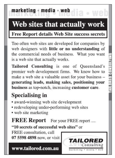
 As the detail of the advertisement shows it shows what they do and how they help others as a freelancer with their contact details and website details in order to be able to be contacted by any means in order to show a professional image to the viewer.
The website is the other option media freelancers can use in order to show off their work and advertise their image to employers which may want to hire them for specific jobs if they have the required skills the employer or employers are looking for such as the animation skills or 3D development skills as shown as advertisements here http://www.themirch.com/adpics/4efee0e86493a64bacebfb6c0.jpg
 The website shows the detail of the work that the freelancers need or have acquired during the work that is shown on the webpage and as it is on the website it would use a link in order to show the contact details and a mail to send to without spreading too much information to not unappeal the reader.